
【Python数据分析案例】(四十五)——基于K均值的客户聚类分析可视化

网盘截屏
案例背景
本次案例带来的是最经典的K均值聚类,对客户进行划分类别的分析,其特点是丰富的可视化过程。这个经典的小案例用来学习或者课程作业在合适不过了。
数据介绍
数据集如下:
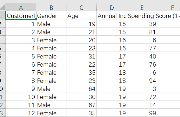
客户的编码,性别,年龄,年收入,还有一个花费分,可能就是消费的越多这个分越高。
下面我们会对这些维度进行分析和可视化,然后进行K均值聚类。主要有这些步骤:
- 导入库。
- 数据探索。
- 数据可视化。
- 使用 K-Means 进行聚类。
- 集群的选择。
- 绘制聚类边界和聚类。
- 聚类的 3D 图
下面开始,当然,需要本期数据案例和全部代码文件的同学还是可以参考:客户聚类
代码实现
导入库
import numpy as np # linear algebra
import pandas as pd # data processing, CSV file I/O (e.g. pd.read_csv)
import matplotlib.pyplot as plt
import seaborn as sns
import plotly as py
import plotly.graph_objs as go
from sklearn.cluster import KMeans
import warnings
import os
warnings.filterwarnings("ignore")

#print(os.listdir("../input"))
数据探索
读取数据
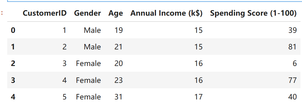
df = pd.read_csv('Mall_Customers.csv')
df.head()
查看数据形状
df.shape

200个样本
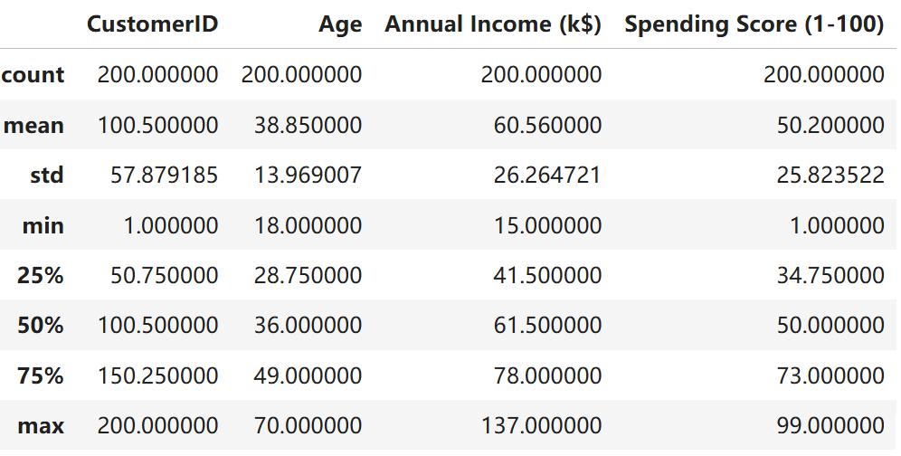
描述性统计
df.describe()
查看数据类型
df.dtypes
可以看到编号,年龄,收入,消费分都是数值型数据,年龄是类别变量。
查看是否有空值。
df.isnull().sum()
没有缺失值。
数据可视化
设置一下画图风格
plt.style.use('fivethirtyeight')
直方图
画年龄,收入,消费的直方图
plt.figure(1 , figsize = (15 , 6))
n = 0
for x in ['Age' , 'Annual Income (k$)' , 'Spending Score (1-100)']:
n += 1
plt.subplot(1 , 3 , n)
plt.subplots_adjust(hspace =0.5 , wspace = 0.5)
sns.distplot(df[x] , bins = 20)
plt.title('Distplot of {}'.format(x))
plt.show()
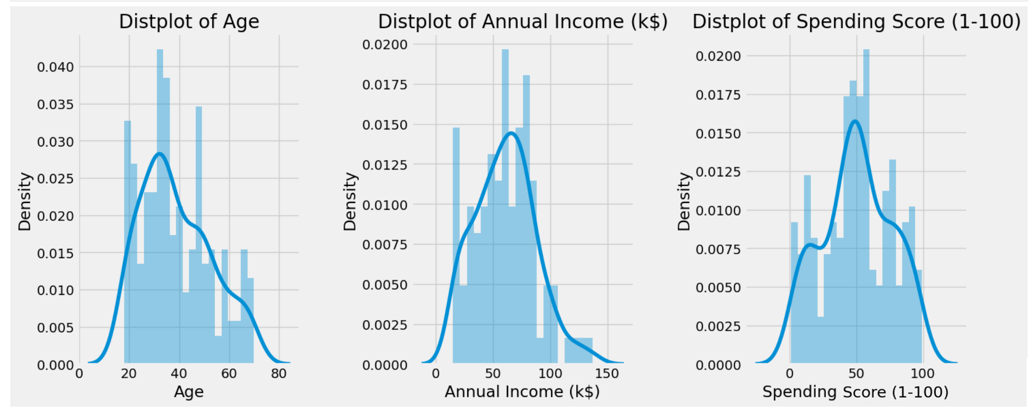
可以看到分布都还很正常,类似正态,没有极端分布。
性别统计柱状图
plt.figure(1 , figsize = (15 , 5))
sns.countplot(y = 'Gender' , data = df)
plt.show()
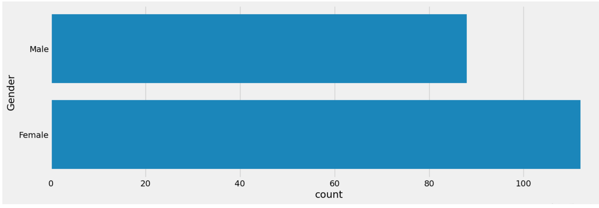
女性比男性多。
画出年龄,收入,花费等关系
画出他们两两的散点图和回归线
plt.figure(1 , figsize = (15 , 7))
n = 0
for x in ['Age' , 'Annual Income (k$)' , 'Spending Score (1-100)']:
for y in ['Age' , 'Annual Income (k$)' , 'Spending Score (1-100)']:
n += 1
plt.subplot(3 , 3 , n)
plt.subplots_adjust(hspace = 0.5 , wspace = 0.5)
sns.regplot(x = x , y = y , data = df)
plt.ylabel(y.split()[0]+' '+y.split()[1] if len(y.split()) > 1 else y )
plt.show()

可以看到年龄和消费是负相关,年龄和收入没有明显的关系。
不同性别的收入
plt.figure(1 , figsize = (15 , 6))
for gender in ['Male' , 'Female']:
plt.scatter(x = 'Age' , y = 'Annual Income (k$)' , data = df[df['Gender'] == gender] ,
s = 200 , alpha = 0.5 , label = gender)
plt.xlabel('Age'), plt.ylabel('Annual Income (k$)')
plt.title('Age vs Annual Income w.r.t Gender')
plt.legend()
plt.show()
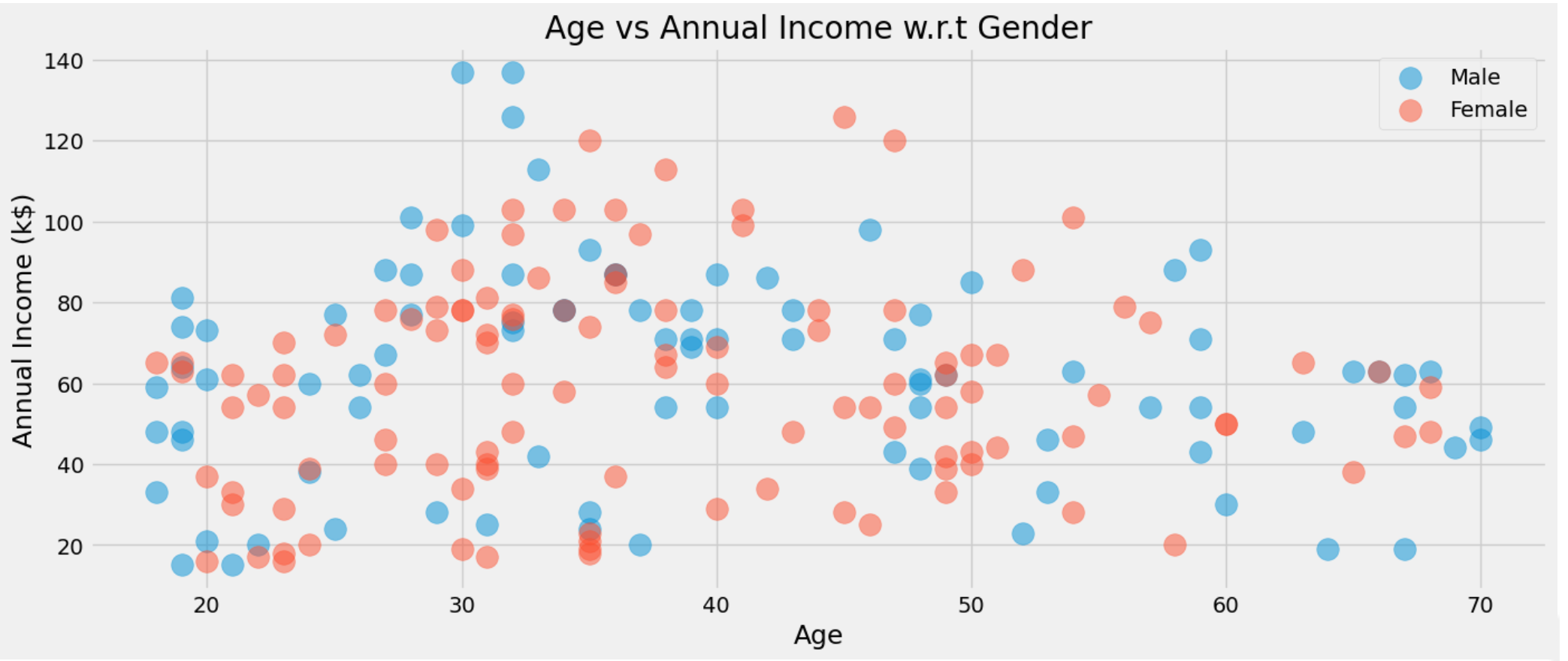
性别和收入感觉也没太多关系,
plt.figure(1 , figsize = (15 , 6))
for gender in ['Male' , 'Female']:
plt.scatter(x = 'Annual Income (k$)',y = 'Spending Score (1-100)' ,
data = df[df['Gender'] == gender] ,s = 200 , alpha = 0.5 , label = gender)
plt.xlabel('Annual Income (k$)'), plt.ylabel('Spending Score (1-100)')
plt.title('Annual Income vs Spending Score w.r.t Gender')
plt.legend()
plt.show()
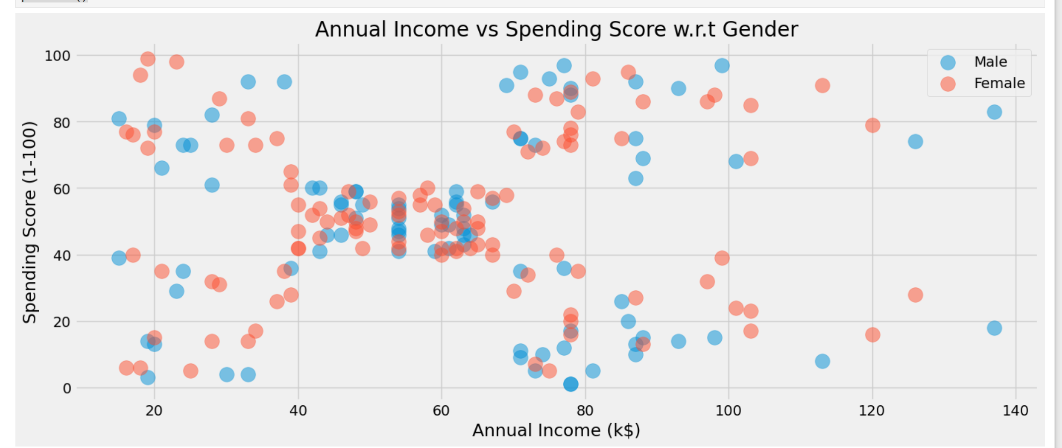
性别和消费感觉也没太多关系,
按性别划分的年龄、年收入和支出得分的值分布
画出他们的小提琴图
plt.figure(1 , figsize = (15 , 7))
n = 0
for cols in ['Age' , 'Annual Income (k$)' , 'Spending Score (1-100)']:
n += 1
plt.subplot(1 , 3 , n)
plt.subplots_adjust(hspace = 0.5 , wspace = 0.5)
sns.violinplot(x = cols , y = 'Gender' , data = df , palette = 'vlag')
sns.swarmplot(x = cols , y = 'Gender' , data = df)
plt.ylabel('Gender' if n == 1 else '')
plt.title('Boxplots & Swarmplots' if n == 2 else '')
plt.show()

该可视化展示了男性和女性两种性别的年龄、年收入和支出得分分布。每个子图都展示了箱线图和群图的组合,可提供有关数据分布和各个数据点的详细见解。
该可视化展示了男性和女性两种性别的年龄、年收入和支出得分分布。每个子图都展示了箱线图和群图的组合,可提供有关数据分布和各个数据点的详细见解。
分析
年龄
男性:
男性的年龄分布范围似乎很广,大约从 20 岁到 70 岁。
较低年龄组的密度较高,表明较低年龄段的男性较多。
女性:
女性的年龄分布略微偏向年轻年龄组,在 20-40 岁左右的年龄段达到明显的峰值。
与男性相比,女性的传播更集中在较低年龄段。
年收入
男性:
男性的年收入分布很广,从大约 20,000 美元到 140,000 美元不等。
收入在 50,000 至 80,000 美元之间的男性密度明显较高。
女性:
女性的年收入范围也较大,但分布相对于男性来说稍微集中一些。
密度较高,在 40,000 美元到 80,000 美元左右。
消费评分
男性:
男性的消费分数分布广泛,从 1 到 100。
低端和高端都有峰值,表明低消费者和高消费者聚集。
女性:
雌性的分布与雄性相似,但中间范围的密度略高(约 50)。
这表明女性的消费模式更加均衡。
重要见解
年龄分布:
两种性别的人口峰值都较年轻,但男性的年龄范围更广,而女性则更多地集中在较低的年龄段。
收入分配:
男性的收入范围更加多样化,而女性的收入则集中在特定范围内(40,000 美元至 80,000 美元)。
消费分数:
两种性别的消费分数差异很大,男性的两端都有明显的峰值,这表明消费模式更加独特。
结论
可视化结果详细比较了男性和女性的年龄、年收入和支出分数分布。它强调,虽然两种性别有一些相似之处,但这些变量的集中度和分散度存在显著差异。男性在年龄和收入方面的分布往往更广泛,而女性则在特定范围内表现出更高的集中度。支出分数表明两种性别的消费行为各不相同,男性表现出更多的极端值。
使用 K- 均值进行聚类
1.使用年龄和消费评分进行聚类和分类客户
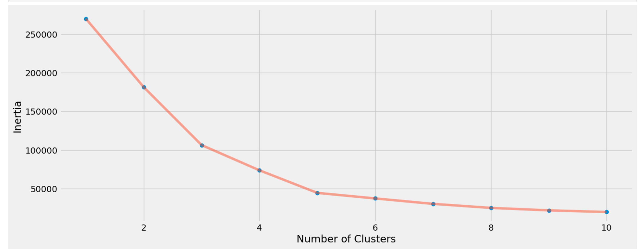
首先k均值我们得需要考虑K的数量。所以我们遍历1-11类,查看不同类别下的平方和距离,找一个合适值。
'''Age and spending Score'''
X1 = df[['Age' , 'Spending Score (1-100)']].iloc[: , :].values
inertia = []
for n in range(1 , 11):
algorithm = (KMeans(n_clusters = n ,init='k-means++', n_init = 10 ,max_iter=300,
tol=0.0001, random_state= 111 , algorithm='elkan') )
algorithm.fit(X1)
inertia.append(algorithm.inertia_)
可视化不同K,也就是聚类数量和平方和损失的值。
选择基于惯性的 N 个聚类(质心和数据点之间的平方距离,应更小
plt.figure(1 , figsize = (15 ,6))
plt.plot(np.arange(1 , 11) , inertia , 'o')
plt.plot(np.arange(1 , 11) , inertia , '-' , alpha = 0.5)
plt.xlabel('Number of Clusters') , plt.ylabel('Inertia')
plt.show()

可以看到k从1到4损失下降的较多,4之后就下降的比较少,所以我们选择K=4作为聚类的数量。
训练,给标签
algorithm = (KMeans(n_clusters = 4 ,init='k-means++', n_init = 10 ,max_iter=300,
tol=0.0001, random_state= 111 , algorithm='elkan') )
algorithm.fit(X1)
labels1 = algorithm.labels_
centroids1 = algorithm.cluster_centers_
聚类中心存在centroids1里面
h = 0.02
x_min, x_max = X1[:, 0].min() - 1, X1[:, 0].max() + 1
y_min, y_max = X1[:, 1].min() - 1, X1[:, 1].max() + 1
xx, yy = np.meshgrid(np.arange(x_min, x_max, h), np.arange(y_min, y_max, h))
Z = algorithm.predict(np.c_[xx.ravel(), yy.ravel()])
进行可视化
plt.figure(1 , figsize = (15 , 7) )
plt.clf()
Z = Z.reshape(xx.shape)
plt.imshow(Z , interpolation='nearest',
extent=(xx.min(), xx.max(), yy.min(), yy.max()),
cmap = plt.cm.Pastel2, aspect = 'auto', origin='lower')

plt.scatter( x = 'Age' ,y = 'Spending Score (1-100)' , data = df , c = labels1 ,
s = 200 )
plt.scatter(x = centroids1[: , 0] , y = centroids1[: , 1] , s = 300 , c = 'red' , alpha = 0.5)
plt.ylabel('Spending Score (1-100)') , plt.xlabel('Age')
plt.show()
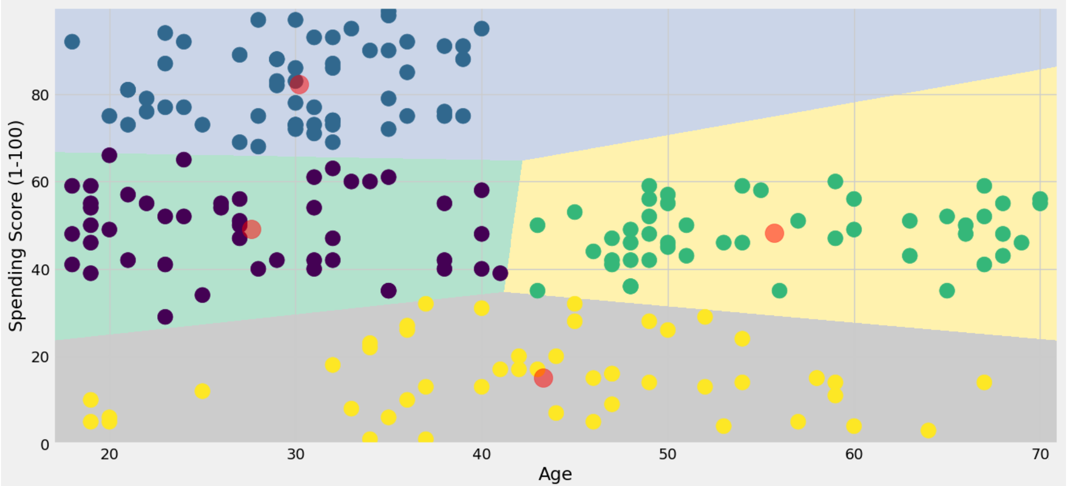
可以清楚的看到每个类别的区间,中心,和分布情况。
2.使用年收入和支出得分进行细分
现在换个2个变量来聚类,使用年收入和支出得分进行聚类和分类
一样的,寻找最优的聚类个数
'''Annual Income and spending Score'''
X2 = df[['Annual Income (k$)' , 'Spending Score (1-100)']].iloc[: , :].values
inertia = []
for n in range(1 , 11):
algorithm = (KMeans(n_clusters = n ,init='k-means++', n_init = 10 ,max_iter=300,
tol=0.0001, random_state= 111 , algorithm='elkan') )
algorithm.fit(X2)
inertia.append(algorithm.inertia_)
可视化
plt.figure(1 , figsize = (15 ,6))
plt.plot(np.arange(1 , 11) , inertia , 'o')
plt.plot(np.arange(1 , 11) , inertia , '-' , alpha = 0.5)
plt.xlabel('Number of Clusters') , plt.ylabel('Inertia')
plt.show()
这一次k=5的时候感觉是拐点,
聚类,计算中心
algorithm = (KMeans(n_clusters = 5 ,init='k-means++', n_init = 10 ,max_iter=300,
tol=0.0001, random_state= 111 , algorithm='elkan') )
algorithm.fit(X2)
labels2 = algorithm.labels_
centroids2 = algorithm.cluster_centers_
h = 0.02
x_min, x_max = X2[:, 0].min() - 1, X2[:, 0].max() + 1
y_min, y_max = X2[:, 1].min() - 1, X2[:, 1].max() + 1
xx, yy = np.meshgrid(np.arange(x_min, x_max, h), np.arange(y_min, y_max, h))
Z2 = algorithm.predict(np.c_[xx.ravel(), yy.ravel()])
可视化
plt.figure(1 , figsize = (15 , 7) )
plt.clf()
Z2 = Z2.reshape(xx.shape)
plt.imshow(Z2 , interpolation='nearest',
extent=(xx.min(), xx.max(), yy.min(), yy.max()),
cmap = plt.cm.Pastel2, aspect = 'auto', origin='lower')

plt.scatter( x = 'Annual Income (k$)' ,y = 'Spending Score (1-100)' , data = df , c = labels2 ,
s = 200 )
plt.scatter(x = centroids2[: , 0] , y = centroids2[: , 1] , s = 300 , c = 'red' , alpha = 0.5)
plt.ylabel('Spending Score (1-100)') , plt.xlabel('Annual Income (k$)')
plt.show()
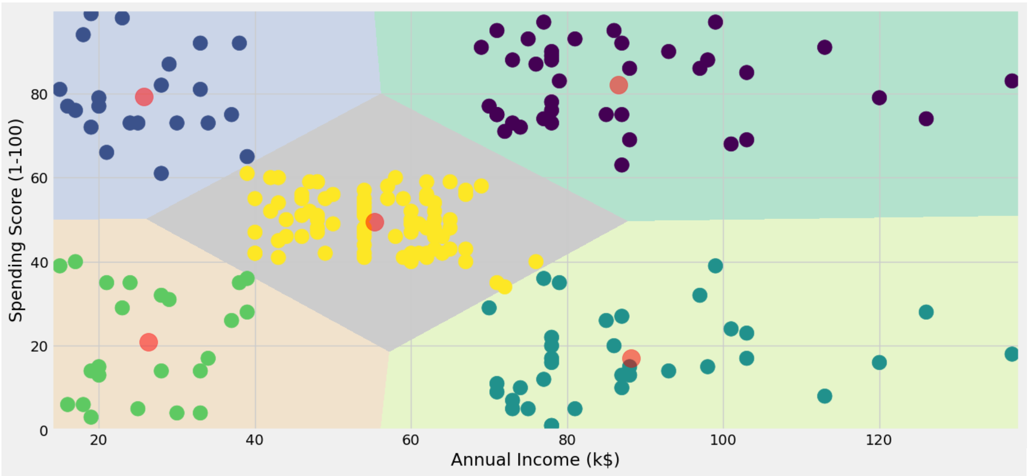
可视化,很清楚的看到每个类别的分布,中心,和区间。
3.使用年龄、年收入和支出分数进行细分
上面是用2个变量,现在吧全部三个变量都用上进行聚类
一样的,先找K的最优取值。
X3 = df[['Age' , 'Annual Income (k$)' ,'Spending Score (1-100)']].iloc[: , :].values
inertia = []
for n in range(1 , 11):
algorithm = (KMeans(n_clusters = n ,init='k-means++', n_init = 10 ,max_iter=300,
tol=0.0001, random_state= 111 , algorithm='elkan') )
algorithm.fit(X3)
inertia.append(algorithm.inertia_)
可视化
plt.figure(1 , figsize = (15 ,6))
plt.plot(np.arange(1 , 11) , inertia , 'o')
plt.plot(np.arange(1 , 11) , inertia , '-' , alpha = 0.5)
plt.xlabel('Number of Clusters') , plt.ylabel('Inertia')
plt.show()
这次K=6的时候比较合适
algorithm = (KMeans(n_clusters = 6 ,init='k-means++', n_init = 10 ,max_iter=300,
tol=0.0001, random_state= 111 , algorithm='elkan') )
algorithm.fit(X3)
labels3 = algorithm.labels_
centroids3 = algorithm.cluster_centers_
三维的图可视化就麻烦点,就用plotly来画
df['label3'] = labels3
trace1 = go.Scatter3d(
x= df['Age'],
y= df['Spending Score (1-100)'],
z= df['Annual Income (k$)'],
mode='markers',
marker=dict(
color = df['label3'],
size= 20,
line=dict(
color= df['label3'],
width= 12
),
opacity=0.8
)
)
data = [trace1]
layout = go.Layout(
# margin=dict(
# l=0,
# r=0,
# b=0,
# t=0
# )
title= 'Clusters',
scene = dict(
xaxis = dict(title = 'Age'),
yaxis = dict(title = 'Spending Score'),
zaxis = dict(title = 'Annual Income')
)
)
fig = go.Figure(data=data, layout=layout)
py.offline.iplot(fig)
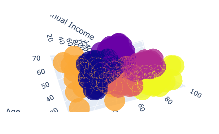
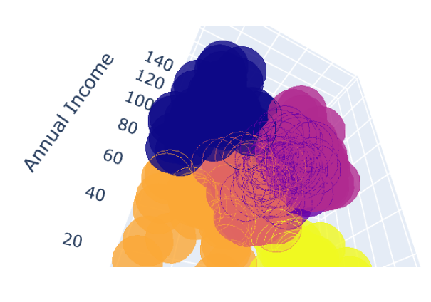
这个图在jupyter里面是可以进行拖拽和放大的,很方便的观察不同客户的特点。
可以看到不同类别的客户特点,来以此进行定制化策略。
创作不易,看官觉得写得还不错的话点个关注和赞吧,我们会持续更新python数据分析领域的代码文章~(需要定制类似的代码可私信)


